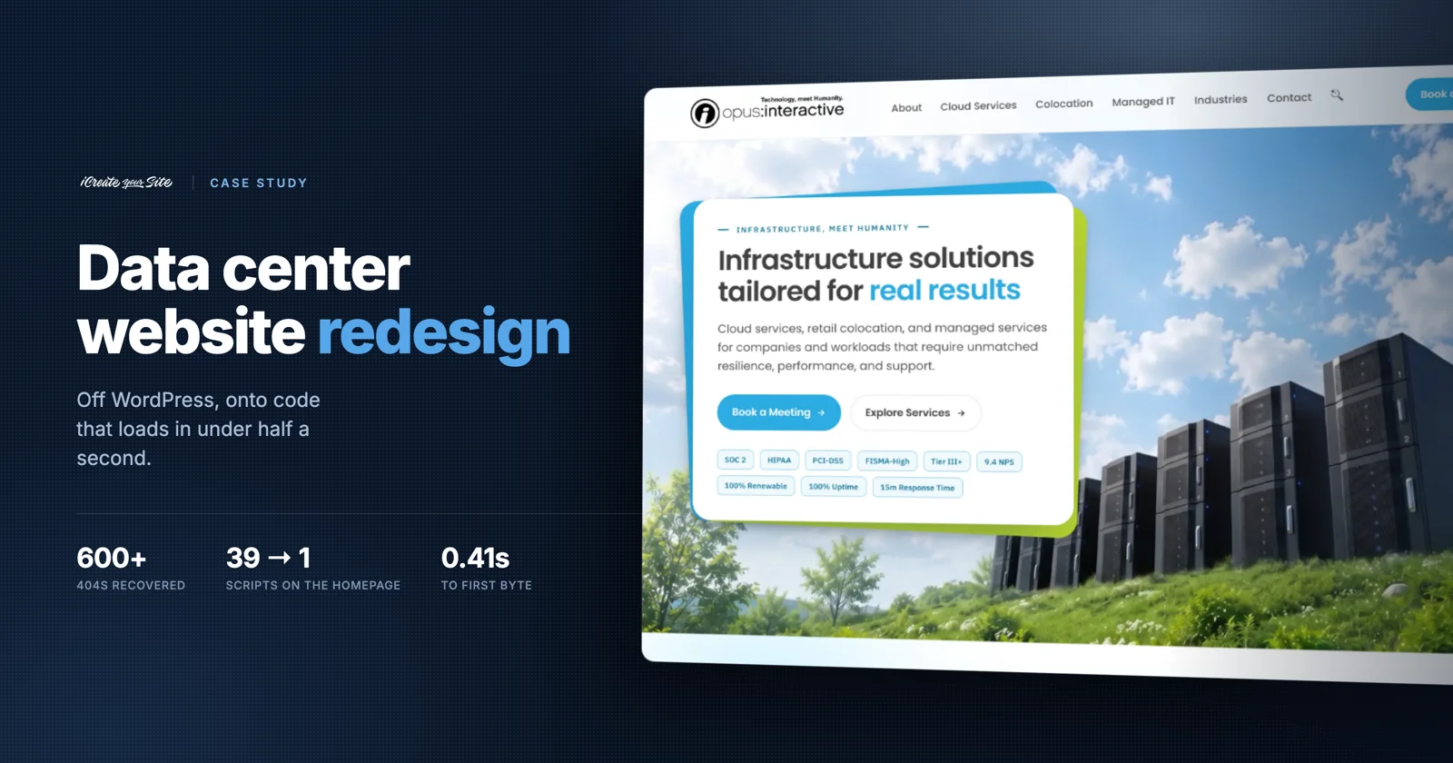
Data center website redesign · Case study
Their website was costing them customers
Opus Interactive has run data centers since 1996. Their website was sending over 600 visits to error pages, had no way for anyone to book a meeting, and loaded 39 separate scripts before a word appeared on screen. Here is what we found, what we built, and what changed.
What we found during discovery
Opus is not a small company. Three data centers, SOC 2, HIPAA, PCI-DSS and FISMA-High compliance, and technical buyers who check things carefully. The website was the weakest thing they owned.
It had been built and rebuilt on WordPress over many years, on a bought theme with a drag-and-drop page builder on top. That is a normal way for a site to end up, and it is hard to see from the inside. Everyone at the company already knows where to click.
So we measured before we pitched anything. Three problems came out of it, each with a number attached.
Visitors were landing on error pages
Their analytics showed over 600 visits hitting 404 pages. At some point the blog had moved and a library of PDFs had been dropped, but Google still had the old links indexed. Every click on one of those results went nowhere, and the ranking those pages had built up over the years went with them.
There was no way to book a meeting
The "Schedule a Discovery" page was a contact form with a reCAPTCHA in front of it. You filled it in, and then you waited for someone to email you back. For a company selling to people comparing three vendors in the same week, that is a slow way to start a conversation.
The homepage was loading far too much
We pulled the homepage exactly as a browser received it. Just under half a megabyte of HTML, 39 external JavaScript files, 18 stylesheets and another 14 blocks of styling written into the page. Eight plugins and themes were each adding their own, including a performance plugin that was itself one of the loads.
Old homepage
- HTML delivered
- 478,541 b
- JavaScript files
- 39
- Stylesheets
- 18
- Inline style blocks
- 14
- Plugins serving assets
- 8
New homepage
- HTML delivered
- 155,168 b
- JavaScript files
- 1
- Stylesheets
- 1
- Inline style blocks
- 0
- Plugins serving assets
- 0
The one script left is Google Analytics. Compressed for delivery, the new homepage is 39.6 KB.
A hosting company with a slow website is arguing against itself on its own home page.
Why this mattered commerciallyWe fixed major issues before even starting
A rebuild takes months. The 404 problem was costing them traffic every day in the meantime, so we treated it as a separate job and shipped it first, on the old site.
We pulled every broken URL out of their analytics and search data and checked all 108 of them by hand against live pages. Not in bulk. A redirect pointing somewhere irrelevant is barely better than an error page, because the visitor still leaves and Google still notices.
We graded every match and told them which was which:
- 47 strong matchesThe same page, or the same document re-uploaded somewhere new. A direct swap.
- 48 close matchesNo identical page exists, but a relevant one does. The visitor still gets what they came for.
- 13 with no equivalentObsolete files with nothing to point at. These go to the homepage, which is at least honest.
We wrote it up in plain English, sent it to their CEO on 21 July, and changed nothing until she approved it. That mattered. Some of those old URLs were press releases and technical documents, and she knew which ones still had value to the business.
Why this survived the rebuild
Redirects are usually the first thing lost when a site is replaced, because they sit in a plugin that gets left behind. We exported all of them and compiled them into the new site's server config: 207 rules, applied before anything else runs.
Re-checked on the day this was published, a random sample of 30 of those old addresses all still land on a live page.
Getting their content out of WordPress
The biggest risk in any rebuild is the content. Copy and paste 232 pages by hand and things get missed, mangled or quietly reworded. So we built a tool to do it instead.
Our content extractor opens every page in a real browser, waits for it to finish rendering, opens any accordions and tabs so nothing stays hidden, then reads the page the way a person would. Headings, body copy, lists, tables, link text, form labels, and the background images that page builders keep in a stylesheet rather than in the page.
On Opus it read 232 pages and recovered 9,254 blocks of content totalling 155,015 words, averaging 92.1% coverage per page. The 1,313 lines it could not confidently classify were listed by name in a report for a human to check, rather than dropped without telling anyone.
Clearing out years of SEO junk
About 8% of what was on those pages was not content. Some of it was interface furniture. Some was there purely to game search engines, and had been for long enough that nobody at the company remembered adding it.
Removed from every page · specimen
portland beaverton hillsboro gresham wilsonville newberg salem eugene
          newport coos bay grants pass lincoln beach astoria
keyword stuffingvancouver battle ground camas longview woodland centralia olympia tacoma seattle dallas houston virginia district of columbiakeyword stuffingrequest a quote in oregon washington virginia and texastemplated heading100counter fragment%counter fragment29counter fragment+ yearscounter fragmentread more/hideinterface chrome
The city lists came from a local-SEO plugin and ran on nearly every page. The loose numbers and symbols are one animated statistic ("29+ years", "100%") that the page builder had split into four separate pieces of text. Search engines read those pieces exactly as they appear here.
Modern search does not reward a list of city names, it notices it. Taking this out was not tidying up. It removed something that had been working against them.

From a page builder to clean, fast code
A drag-and-drop builder has to be ready for anything you might drag onto the page, so it loads everything on every page whether you used it or not. That is where the 39 scripts came from.
We replaced it with a set of small programs that assemble the site once, on our machine, and write out finished HTML files. The server then has nothing to do except hand over a file. No database query, no plugins loading, no theme working out what to render. The page is already written before anyone asks for it.
Today that is 18 programs run in order, about 9,400 lines of code, producing 276 pages and one 5,270-line stylesheet. It is more moving parts than a page builder, but none of them are sent to the visitor. They stay on our side.
Faster pages, and updates that take minutes
The homepage now arrives in 0.41 seconds to first byte at 39.6 KB compressed. On a phone on a weak connection, that is the difference between a page that is simply there and a page that assembles itself in front of you.
It also changed how updates work. A line of copy that appears on forty pages is edited once and rebuilt everywhere, instead of being found and retyped forty times. And because the output is just files, the site can be hosted anywhere. For a company that sells hosting, that was not a small point.
The build system in detail. 18 generators, one write_page() choke point, and a deploy that verifies every file by hash before it trusts it. Read the technical write-up →Keeping their search rankings
We kept their existing address structure exactly as it was. Every page that ranked kept its URL, so nothing had to earn its position back. Redirects were only used for addresses that genuinely no longer exist.
Most rebuilds do the opposite, and it is the most valuable thing we did for them even though nobody will ever see it.
A booking system they never had
This is the change with the clearest line to revenue. Before, a prospect filled in a contact form and waited. Now they pick a time on a real calendar and it is booked.
The site asks their scheduling system for genuine availability and shows only what is actually free. The access token sits on the server and never reaches the browser, so the calendar can be read without exposing the account.
Three decisions that protect the lead
- Contact details are collected first, times second Their scheduling plan cannot create a booking through an API, so the meeting has to be confirmed on the provider's own page. If we asked for times first, anyone who dropped off at that last step disappeared without trace. Asking for name, email and company up front means the enquiry reaches the sales team either way. An abandoned booking is still a lead.
- Times show in the visitor's own time zone The calendar returns universal timestamps. We were converting them to Pacific, so a visitor in New York saw 11:30 AM, clicked it, and the next screen said 2:30 PM. Same meeting, two different numbers, and a reason to doubt the company before they have even spoken to anyone. Formatting in the browser's own zone made both screens agree.
- The calendar loads in the background while they are still typing Fetching availability only when someone pressed "Next" meant they arrived at an empty grey grid and watched it fill in. An empty calendar does not look like it is loading, it looks like there is nothing available, and people leave. So the moment a visitor clicks into the first field, the site starts fetching the month in the background. By the time they have finished typing their email, the times are already there and the calendar appears complete.
The visitor sees a booking form that works. The business gets a lead whether or not the meeting is ever confirmed.
Bringing "Technology, meet Humanity" to life
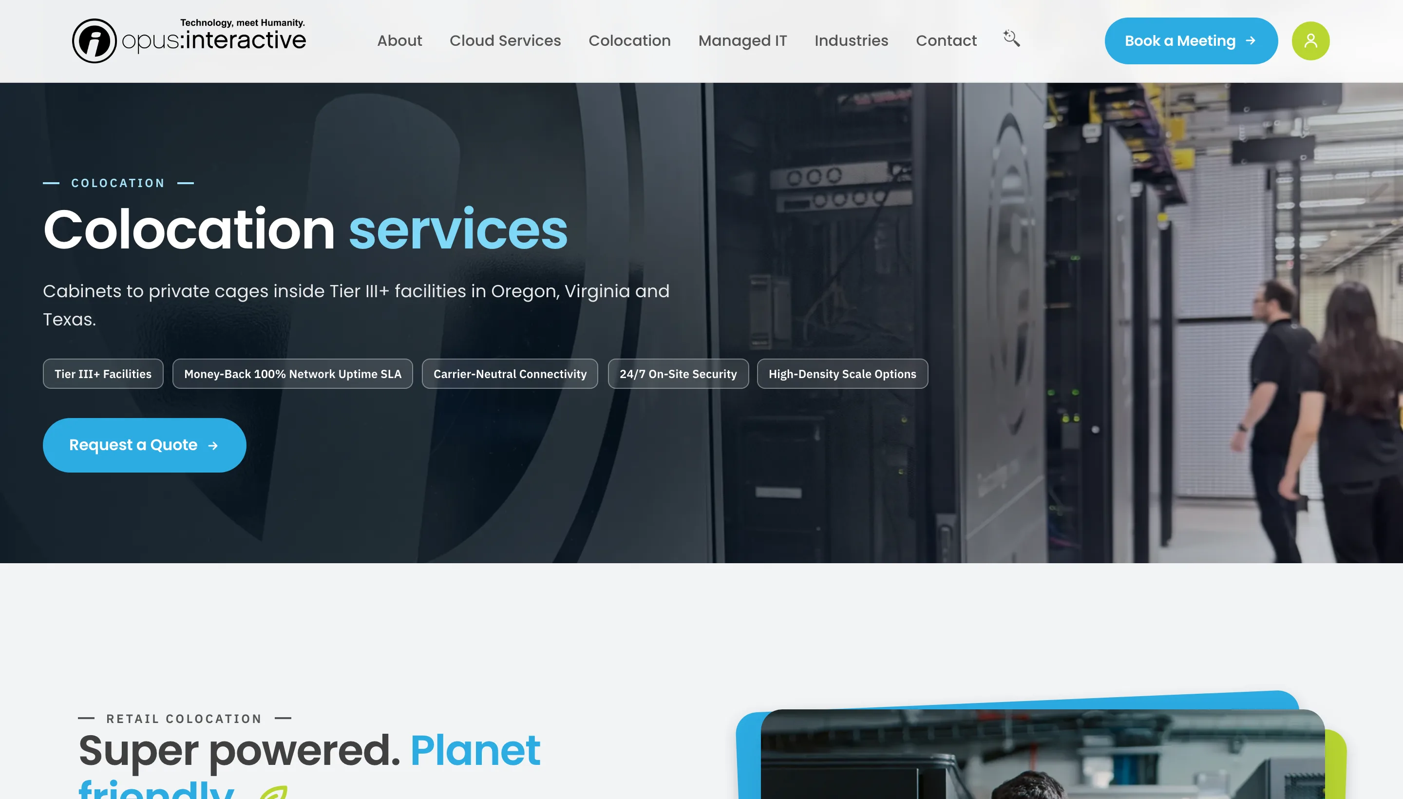
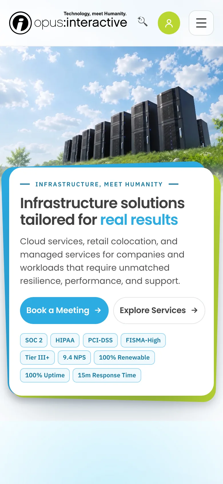
Opus have used that line for years. On the old site it sat as text above stock photos of server racks and blue circuit-board abstractions. The tagline said one thing and every image said the opposite.
So the visual work had a brief, not a mood. Where a page is about people, show people. Where it is about infrastructure, show the real thing instead of a rendering of it.
A custom icon system built from their own assets
Opus had already paid for an icon set they were not using. It arrived as a single 570 KB Illustrator artboard: about 42 icons, mixed in with years of abandoned material off to the side of the canvas, and not one of them appeared anywhere on their website.
We pulled it apart, identified every icon by what it actually depicted, and rebuilt 21 of them into a working system. Each one now sits grey at rest and turns brand blue on hover, driven entirely by the stylesheet rather than by swapping images, so the whole set stays consistent across the site and can be recoloured in one place. They are written straight into the page, which means the browser downloads no icon files at all.
Five sections had no match in their set: About, Careers, Social Responsibility, Blog and Contact. We covered those with our own line icons and documented the whole set, so Opus now has an index of every icon on the site and where each one is used.
A different image for every page
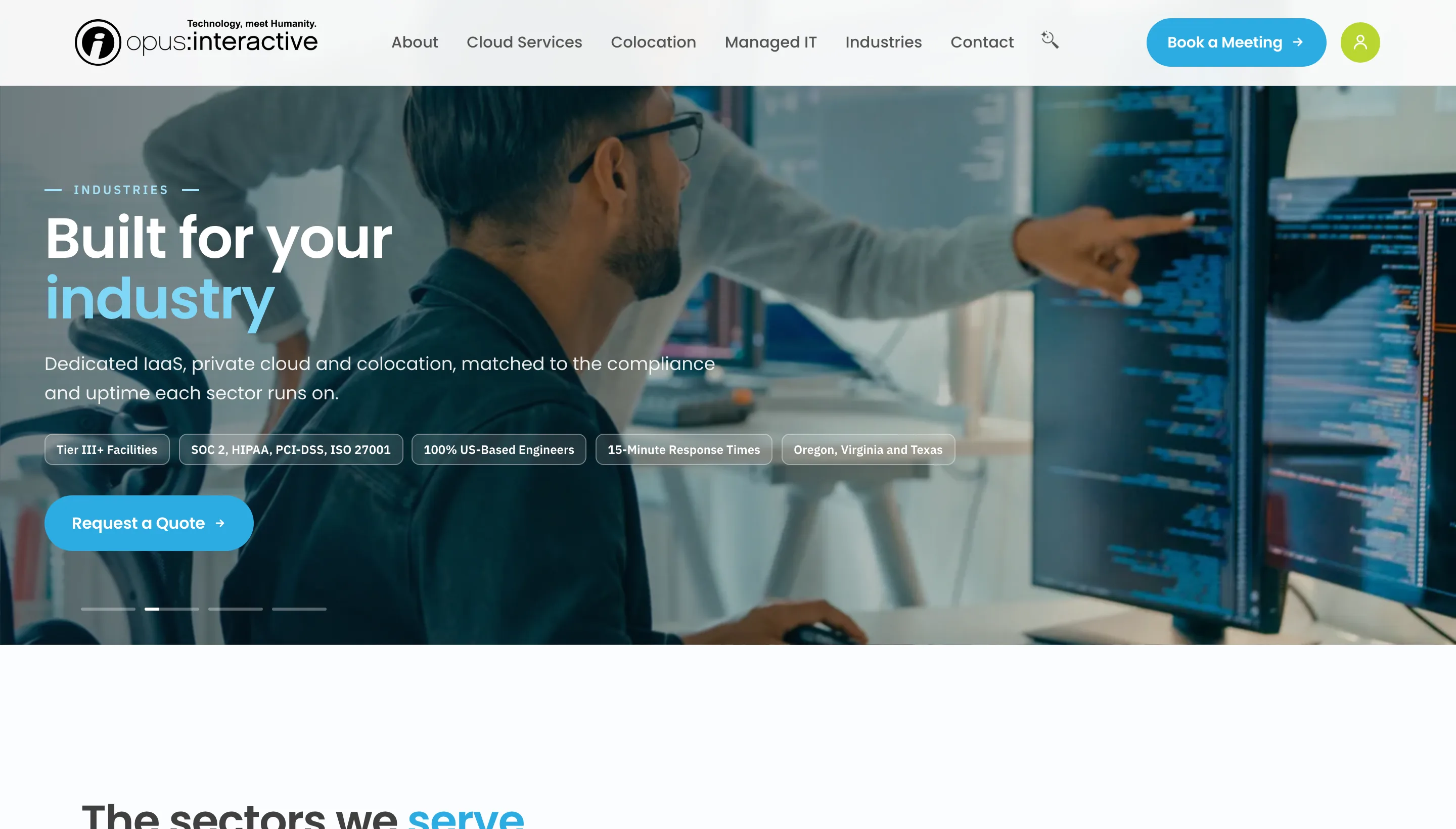
Each service and sector got its own hero, framed for the page it sits on. Cabinets and cages for colocation, an engineer's hands for managed IT, a construction site and a factory floor for those industries, and a generated image of a clinician entering records for healthcare, because honest stock photography of that moment barely exists.
The industries page opens with four of them fading through each other on a timer, with a thin progress line underneath so the movement reads as deliberate rather than as a page still loading. It is the only animation of its kind on the site.
Big images, made small
Twelve of those photographs were doing the most damage to page weight. Converted to a modern format at a quality picked per image rather than applied as one blanket setting, they went from 5.56 MB to 1.98 MB, a 64% cut, with no visible difference at the sizes they display at.
We left everything under 100 KB alone. Below that the saving is not worth another file to maintain.
Making sure every lead gets through
A good-looking form that loses one submission in twenty is worse than an ugly one that never does. Most of the work here went into what happens after someone presses send.
Every enquiry now does three things at once. It emails the sales team, it sends the visitor a confirmation, and it creates a lead in their Salesforce with the source and status already set the way their team expects.
The rule is that none of that is allowed to break the form. If Salesforce is unreachable, the failure is logged, the visitor still gets their confirmation and sales still gets the email. A CRM outage should never be something a customer finds out about.
Cutting spam without a CAPTCHA
Form spam was a real problem, and their old form dealt with it using a reCAPTCHA. We did not carry that over. Puzzle boxes cost real enquiries from exactly the people you want, and on a site selling to busy technical buyers that is a bad trade.
Instead there are three quiet checks: a field only an automated script would fill in, a check on how fast the form was completed, and a limit on how many times one visitor can submit in ten minutes.
Two details came out of a direct question from the client, and both were right. Anyone who has gone as far as choosing a meeting time is almost certainly a real person, so the speed check is switched off completely on the booking form. And nothing is ever silently binned. If a submission is ever blocked by mistake, the visitor is asked to press send again rather than shown a fake success message while their enquiry goes nowhere.
AI search across their own documentation
Their documentation, service pages and blog were indexed into a searchable set of 1,169 passages, so someone can ask a plain question and get an answer out of Opus's own material instead of ten blue links. Their buyers arrive with specific technical questions, so that is a shorter route to a conversation.
Easy for customers, optimized for speed
The ordinary way to build this is to hand the visitor's question and the whole site to an AI model and let it work out the answer. It is simpler to build, and it is both slower and looser: the model has 1,169 passages to pick from, and a confident answer drawn from the wrong page is worse than no answer at all.
So we put a ranking step in front of it, running on their own server. It reads the question, scores all 1,169 passages against it, and sends only the best seven onward. That is 0.6% of the site per question: around 5,000 characters instead of 875,000.
The visitor feels that in two ways. The answer arrives in about two seconds rather than after a pause long enough to give up on, and it is built only from the passages that genuinely match the question, so there is far less for the model to wander into and invent.
That matters more here than on most sites. Their buyers are technical, they are usually comparing two or three providers at once, and they arrive with specific questions about compliance and architecture. An answer that is quick and correct is a reason to keep reading. One that is slow, or confidently wrong about a certification, ends the visit.
None of this was in the brief, and it was never a cost exercise: the running costs sit inside our own subscription, not on their invoice. We built it this way because someone asking a real question at eleven at night should get a useful answer, and that is what turns a visitor into an enquiry.
The results
| Measure | Before | After |
|---|---|---|
| Homepage HTML delivered | 478,541 b | 155,168 b (39.6 KB compressed) |
| JavaScript files on the homepage | 39 | 1 |
| Stylesheets | 18 files + 14 inline blocks | 1 |
| Time to first byte | not measurable like-for-like | 0.41 s |
| Recorded visits hitting error pages | 600+ | sent to live pages |
| Legacy addresses redirected | in a plugin, at risk | 207, in the server config |
| Booking a meeting | contact form, wait for a reply | live calendar, real availability |
| Spam handling | reCAPTCHA | three invisible checks |
| Hero photography weight | 5.56 MB | 1.98 MB |
| Enquiries reaching their CRM | email only | email + Salesforce lead |
The speed and weight figures are measured on the live site and on a saved copy of the old one. The traffic figure is from their own analytics. We have deliberately not put a revenue number against any of this, because we do not have one, and a rebuild that happens to coincide with a good quarter did not necessarily cause it.
How we protected the site while we rebuilt it
Opus were running a live business on that website the whole time we were replacing it. Nothing we did was allowed to interrupt that, and most of the work below is the part a client never sees.
Their approval came before any change. The redirect map went to their CEO as a written plan, graded by match quality, and we applied nothing until she signed it off. She knew which old press releases and technical documents still mattered to the business. We did not, and guessing would have been the wrong call.
The old site kept running, untouched. We shipped the 404 recovery onto their existing WordPress rather than holding it back for launch day, so they stopped losing that traffic months before the new site existed.
The cutover was staged on purpose. We uploaded 498 files first and held back the six that actually flip the site over, so the old site served normally right up to the final second. Done this way, a rollback is a two-minute file copy instead of a restore from backup. Their WordPress install is still on disk, intact, ready to go back if it is ever needed.
We read their whole tag container before removing anything. What looked at first like a duplicate analytics tag was not. Their tag manager was also running call tracking that rewrites every phone number on the site, plus three other marketing tools. Tidying up the apparent leftover would have broken attribution their marketing team depends on.
Our tools report what they cannot handle. The content extractor listed 1,313 lines by name for a human to check rather than dropping them quietly. On a 232-page migration, the dangerous tool is the one that always appears to succeed.
How the cutover was engineered. Why six files were held back, how we probed the server's DirectoryIndex order, and the hash-verified deploy behind it. Read the technical write-up →If any of this sounds like your website
What we see most often is not a badly built site. It is a site that was built properly a few years ago, has had things added to it since, and is now quietly underperforming in ways nobody has measured. The 404s, the form that loses submissions, the homepage that takes four seconds on a phone. None of it is obvious until someone looks.
We are happy to look and tell you what we find, whether or not it turns into work.
Talk to us about your site Prefer the engineering detail? The full technical write-up covers the build system, the URL audit, the hash-verified deploy, the abuse controls and five defects with the checks that caught them. Read the technical write-up →Published 29 September 2026 by iCreate Your Site for Opus Interactive. Figures were measured on the live site and on a captured copy of the previous site, and re-checked on the day of publication.